Below is the first part of a review of the Lisbon design biennale ExperimentaDesign 2005 that I wrote for the Polish review
Architektura (to be published soon, in a shorter and slightly modified version). Translated here for your global enjoyment.
ExperimentaDesign 2005: The Medium is the Goal
 The Lisbon ExperimentaDesign 2005 is a biennale of paradoxes: brilliant works stand next to silly provocations, ingenious discoveries next to funny, though useless ideas.
This is hardly a surprise. Contemporary design remains in a state of tension between its high culture-forging aspirations and the commercial prose of life. Money can’t buy everything (e.g. many projects are related to activism); but even what it can’t buy has to be sold. Even if it is to convince others.
That’s where modern design gets all its power. It quietly enters more and more parts of our lives: from publicity to politics, from architecture to film, from media to street art. It does it quietly, although the limit of culture and commerce seems like an ideal situation to remain in the center of attention. Still, designers rarely appear on magazine covers or TV shows.
The Lisbon biennale moves design out of the shadow of anonymity. In a well-prepared, incredibly diversified series of exhibitions it shows the trends, the fashions, but also the characteristic styles and unique approaches. It’s not afraid of controversy; on the contrary, it proves that yesterday’s scandals are today’s common bread. You can feel it’s an ongoing experiment - although it doesn’t always mean innovation. 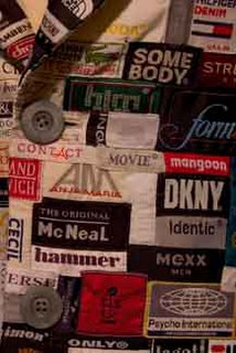 Sometimes, it’s as simple as juxtaposing a commercial with a political flyer, or using classical design in an artistic installation.
The 6-year-old biennale has a strategic partner for its main events: the Belém Center of Culture. This large complex far from Lisbon’s center, created from the first funds of the then European Community, is a symbol, that the Portuguese, usually full of complexes, can do it after all. The modern, if modest-looking, building contains concert and theater halls, exhibition spaces, and among them an excellent Museum of Design. But this time the Museum is empty. The visitors line up to the biennale’s largest exhibition, Catalysts!
Catalysts! is an exhibition with a thesis. According to the curator Max Bruinsma, we can’t consider designers neutral helpers any more, professionals limited to solve the clients problems. They are rather “critical cultural agents”, or - “cultural catalysts”. That’s why in an exhibition which might at first seem as a classical graphic design showing, we get something far beyond - communication design, ranging from typeface to publicity to video to logos to fine art to pretty much anything that communicates.
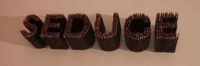
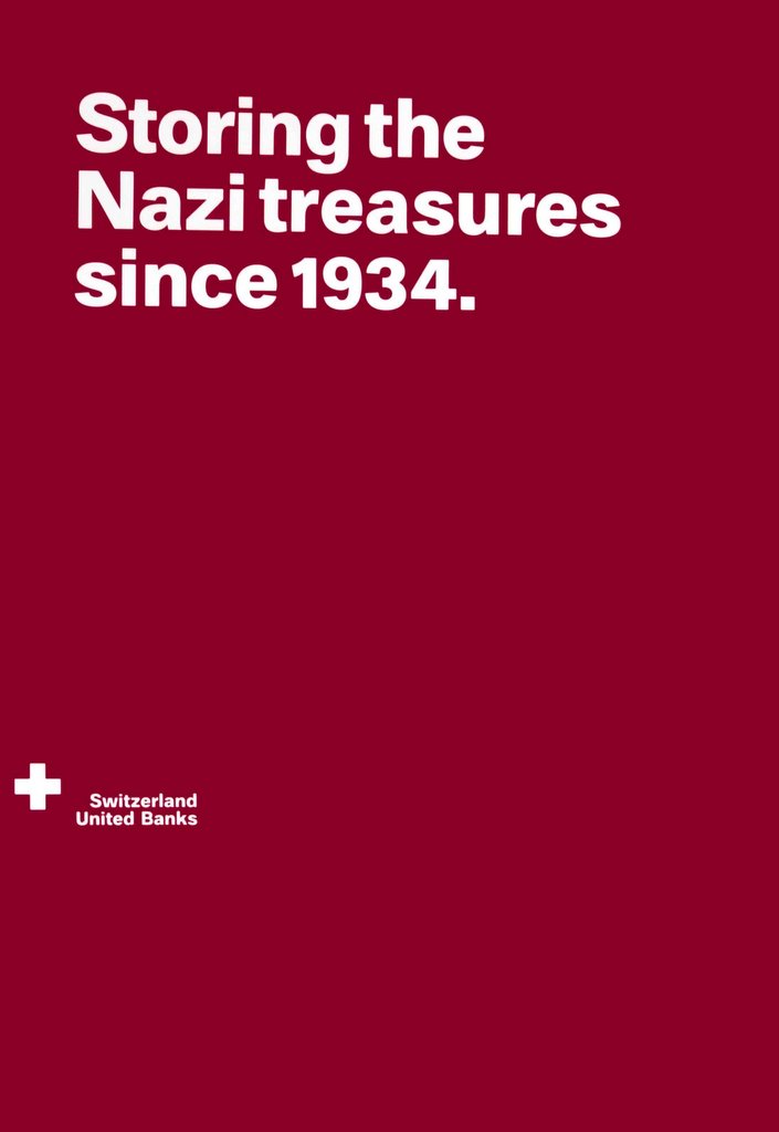
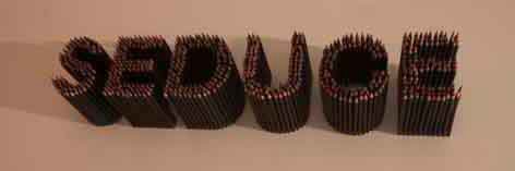
The exhibition is divided into four main, autonomous parts: Believe, Seduce, Inform and Engage. But actually it’s all just one big seduction. And as it is usually case with flirts, it’s not the message, but the very process of transmitting that plays the main part. Soviet propaganda (considered as the beginning of modern design!), pro- and antiwar posters coexist with commercials of soap or underwear. Next to the chronology of design, we find a quote from Henry Ford: “We want artists in industrial relationship. (...) We want those who can mould the political, social, industrial, and moral mass into a sound and shapely whole”. The unsettling motto has no comment next to it concerning the (controversial) morality of Ford himself. Designers are also not interested in the analyses of the content of the Bolshevik postulates or discriminating commercials.
 Designers-catalysts are interested in attracting attention. On a poster created in 1999 as publicity for his own lecture, one of the most renowned contemporary designers Stefan Sagmeister (who recently won a National Design Award), we see the naked author. All the information was cut out on Sagmeister’s skin by his assistant. This cynical use of one’s own body is one of many examples of adapting artistic ideas from the 60’s and 70’s to commercial purposes.
Using historical motives isn’t limited to one era: any past is good for transformation. Thus, we can find a pastiche of the great publicity classic made by Tide in the 50’s, made by James Langdon. The name of the product is replaced by the word “ediT” (the name of the work is “Turn the Tide”), inviting to a creative game with the past. Catalysts! shows the best of the players. Instead of creating a new, expensive brand image, they use ready solutions everyone knows, acting through a subversion of meaning, encouraging us, the consumers, to think - and to choose the graphic Robin Hood. One that’s incredibly similar to his colleagues, the artists... with one exception: contrary to the artists from the 70’s, today’s designers don’t seem to be overtly worried with why something is important. And that is, no matter what they might wish us to believe. Langdon does not explain why he chose precisely washing powder. Sagmeister’s self-inflicted wounds are important only because they are visible. It is supposed to be the viewer’s task to develop a critical distance. Yes, but how?
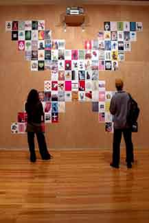
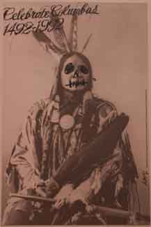
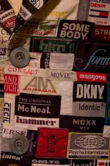
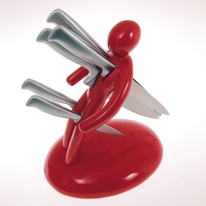
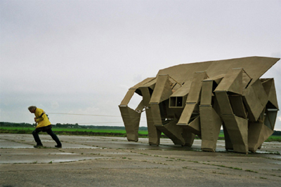
Pictures: 1&2: The Most Expensive Dress, Silke Wawro; 3: Seduce, Max Bruinsma (?); 4: Poster, Stefan Sagmeister. All photos by Verónica Fernandes.